HELL Partners Screening Style: Red, Black and the Details
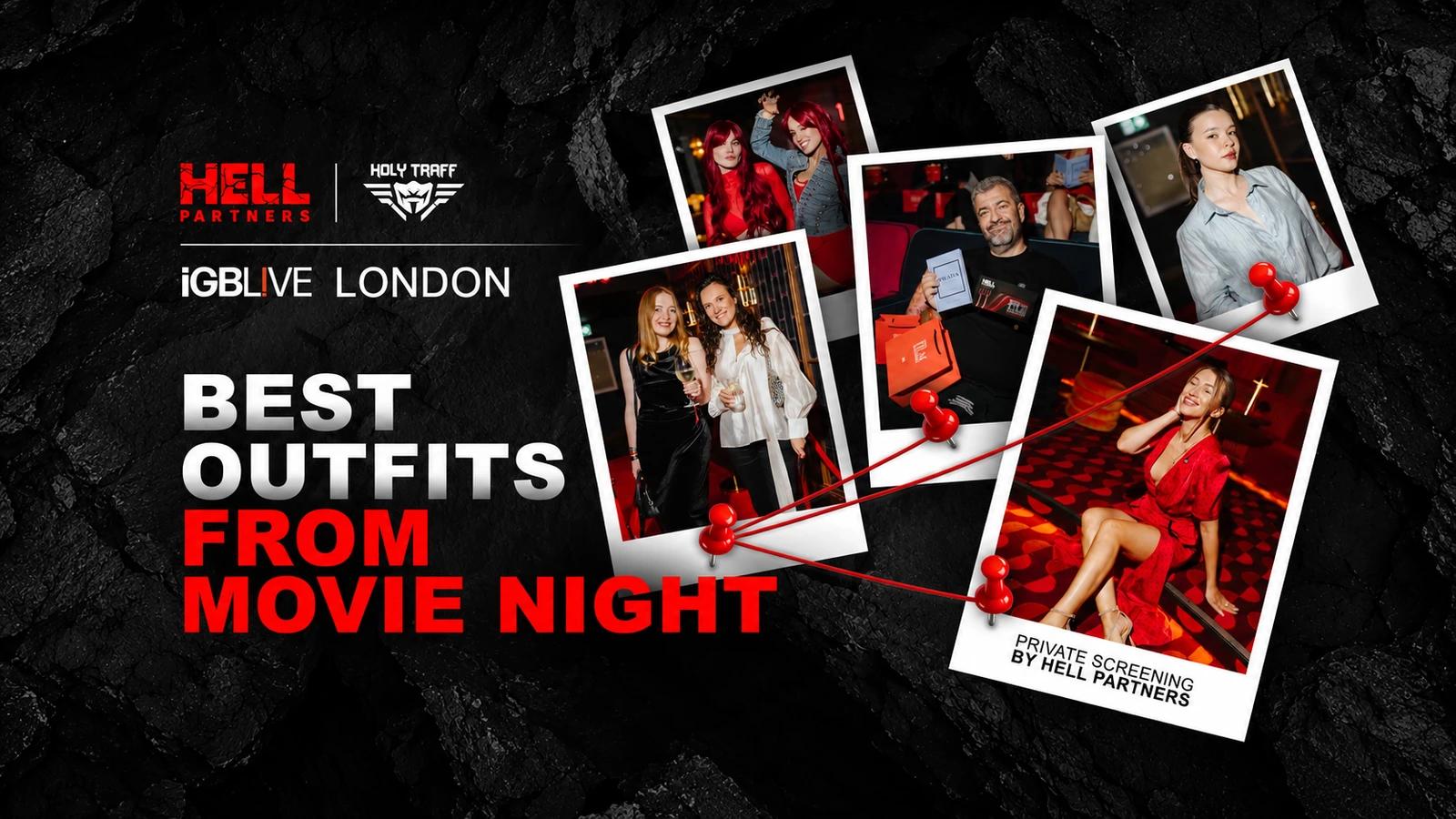
A private screening offered a different pace after conference days: an opportunity to put presentations aside and look more closely at the evening. HolyTraff’s fashion feature, published on 22 July 2026, captured VIP Screening by HELL Partners in nineteen photographs. The recommended elegant cocktail or smart attire guidance set a direction, while black, burgundy and red connected the palette. We look at colour, silhouette and detail in the selection supported by HELL Partners. It does not rank guests by the price of their clothes or draw conclusions about people from what they wear.
Dress guidance as a shared direction
The dress code served as a starting point rather than a uniform. Long dresses, suits, shirts and more relaxed combinations appeared alongside each other. A common theme stayed visible, even though nobody tried to dress the whole room identically.
The selection does not name the guests or most clothing labels. The portraits therefore remain anonymous, and the combinations are described without guessing designers or professional roles. Personal qualities should not be inferred from a photograph merely because a look is expressive.
The three-person portrait with screening booklets demonstrates the palette’s principle: black, white and red meet within one group. Each guest retains a different proportion of colour. That creates a visual connection between the looks without making them identical.

Red: a continuous silhouette or a repeated accent
The first photograph, with two red outfits and long red hair, introduces a theatrical mood. Repeating colour through several elements makes it a theme across the portrait. Makeup plays its part too, though there are no details on specific products or application methods.

A long red dress on the carpet uses a different approach, giving the extended silhouette the leading role. When colour is already prominent, other details do not have to compete. The principle works for your own styling as well, and it does not mean giving up accessories altogether.

The red polka-dot dress offers another, lighter interpretation. Beige sandals avoid repeating the saturated colour, so the combination is not one uninterrupted red block. Its vintage mood is only an editorial impression: the garment’s date and origin are unknown.

Another portrait adds a white blazer and black bag to a red dress. The light layer changes the larger proportions and reframes the same colour. The idea works well in this combination, but it should not be treated as a universal answer for every season or setting.

A red halter top, white ruffled skirt and red shoes build the outfit through repetition. The upper section and footwear connect across a light interval. Several separate garments can support one theme without matching textures throughout.

Tailoring and shirts offer different levels of formality
The duo in a grey suit and black sequined jacket combines clear lines with a more evening-oriented surface. One element can remain restrained while another attracts attention. Sequins say nothing about a garment’s price and do not by themselves make the look less professional.

A grey-blue shirt, black trousers and broad metal cuff keep the number of leading details small. This provides an example of a transition from daytime clothing to an evening setting. What matters here is coordination: not every business outfit automatically suits a private screening.

A black dress with a grey jacket over the shoulders adds another possibility. The more structured layer appears with a relaxed cinema-seat pose, keeping the outfit within the evening rather than only on its carpet. A photo cannot tell us how comfortable the wearer felt, but the role of the extra layer is clear.

Two guests pair black blazers with white T-shirts, using a light base to soften the overall formality. This is another interpretation of smart attire without a full suit formula. Check your particular invitation before borrowing the idea, because the same dress-code phrase can carry different expectations.

Dark palettes: texture rather than universal rules
A short dark-brown dress shows that evening colour does not end with black. A difference in shade can preserve a restrained silhouette without repeating the other portraits literally. “Chocolate” here describes the colour, not the material or a designer label.

A guest in black holding a Prada book and screening booklet connects the portrait to the event. Those objects provide context without identifying the clothing brand. In an all-black outfit, attention moves to line, fit and setting, because there are no colours competing with each other.

A long strapless black dress with a high slit uses a more pronounced silhouette. A lace mini dress plays on something else: differences in density and texture. Both stay within a dark theme while using different means.


The final all-black portrait completes the sequence and offers one more reading of its palette. It should not be treated as a guaranteed answer for every occasion: for your own choice, what matters more is how the clothing fits the setting and how you feel in it.

Black, white and the smaller accents
A white top, checked skirt and pearl necklaces create a portrait with several smaller details. The check supplies pattern while the jewellery contributes another light line. The French mood here is only a stylistic comparison and says nothing about the outfit’s origin.

In the portrait with bright orange hair, a black top and wide white trousers leave the colour accent outside the clothes. Another look uses a black blouse, white trousers and grey bag. A similar colour scheme produces different impressions through details and proportions.


A short black dress with a white collar and slip-on shoes suggests that an evening outfit need not require high heels. This applies to a specific combination: not every pair of shoes suits every invitation. Check the invitation and your own comfort together.

Trying the complete outfit can help with preparation. A bag, outer layer and footwear may alter proportion more than another accessory does. The tip concerns only your own choice: it does not require judging anyone else’s taste or ranking the people pictured.
This feature is sponsored by HELL Partners. The 25%+ click-to-deposit, 50%+ registration-to-deposit and more than 20 GEOs stated by the partner are its promotional claims dated 22 July 2026, without a published method. The editorial team has not verified them, and they have no bearing on the clothing discussion.
We covered the partner’s presence at iGB Live 2026 in a separate article.
Questions about screening outfits
Is this a ranking of the best guests?
No, the selection compares combinations without positions or scores. It does not assess people’s wealth or professional ability from photographs.
Can the ideas be recreated with basics?
You can borrow a colour or proportion principle. Most exact clothing labels are unidentified, so the feature requires no particular purchase.
What should you check before a similar screening?
Read the invitation, access conditions and clothing guidance for your own evening. The publication date of this feature is not an invitation to a new event.
What to borrow from the selection
Guests at VIP Screening by HELL Partners used a shared palette differently: continuous red, structured lines, dark textures and a light lower contrast. For your own evening, choose one understandable idea and give it space. Check the invitation’s context, preserve freedom of movement and avoid trying to reproduce another person’s portrait completely. The appeal of this sequence lies in people attending the same screening while keeping individual ways of dressing.